 You may have seen the recent news that Google updated its search algorithm to favor mobile-friendly pages in mobile search results. What does this mean for your organization’s website? There is a significant difference between mobile friendly and mobile responsive design. A quick primer…
A ‘mobile friendly’ version of your site will show a simplified version of your site with some predetermined primary navigation buttons, but that is about it. This is a very cost-effective solution if you are a small company with a very simple site. People accessing sites from a phone are usually just quickly looking for a specific piece of information. Most mobile friendly solutions will give the visitor the option to revert back to a standard view. A major disadvantage is that it strips most of the graphic elements out and presents a very toned down version of your brand.
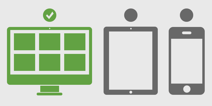
A ‘mobile responsive’ solution automatically changes the layout and/or content to fit the device you’re using. While a client may appreciate a simplified mobile navigation, they will definitely appreciate a site presented in a graphically pleasing manner highlighting your organization’s unique selling proposition. And what if they are visiting your site via a tablet? Mobile responsive design stacks a website’s structure and displays a website that works across all screen sizes – mobile phone, tablet, small desktop/laptop and widescreen monitor. Good design builds a site navigation that presents content in a clear, concise manner regardless of screen size.
At Nurenu, we believe that mobile users are a key segment of your audience, and websites should be optimized to present your brand to the best of its abilities. We have a proven track record of building websites to work across multiple screen sizes. Visit our Portfolio to see how we have been innovating mobile design for our clients since its inception.