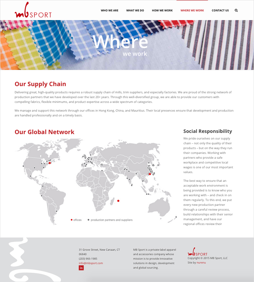
 Sometimes the more simple the graphic, the more of an impact it makes. That’s just what MB Sport wanted on their newly designed and developed website that we launched this past week. The goal was to display their Global Network of offices, partners and suppliers that they have developed over the last 20+ years in a way that isn’t overwhelming to the viewer.
We created a simple and modern world map using a light gray background with dark gray pinpoints to mark the different locations. We used the beautiful red of MB Sport as a subtle accent color and to highlight their office locations.
Sometimes a simple graphic is the perfect solution to get across a point of view, statistics, or any bit of extra information while elevating the look of your website.
Click here to see the MB Sport “Global Network” map on their website.


